---
title: Embedding the search
summary: Create a key, authorise your domains, and put the travel-requirements search into a page of your own.
description: "Embed the World of Regions travel-requirements search: get an API key, authorise your domains, build the URL, and match it to your own palette."
order: 1
updated: "2026-09-14"
---
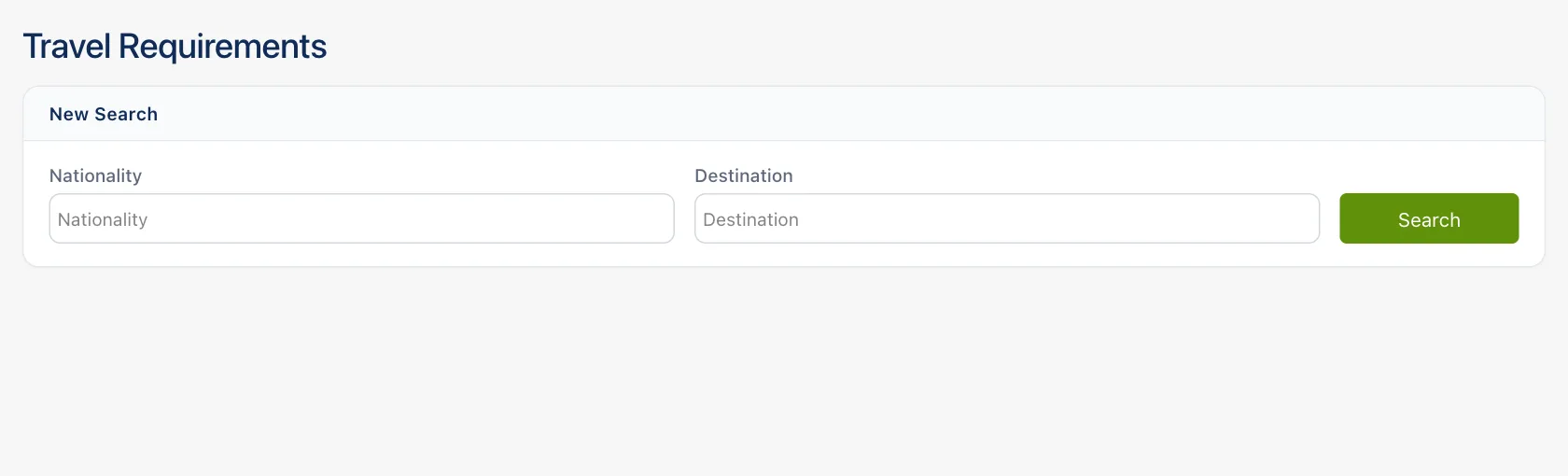
## What the embed is
The travel-requirements search is a complete page you load in an `
```
## What you can configure
Every field is optional except the token, and anything you leave out keeps its default.
| Field | Type | What it does |
|---|---|---|
| `token` | string | Your API key. Sent with every call the embed makes; without it nothing loads. |
| `initialNationality` | string[] | Nationalities selected when the panel opens, as ISO 3166-1 alpha-3 codes (`POL`, `ESP`). |
| `destinationCountry` | string[] | Destinations selected when the panel opens, same code form. |
| `disableChangeDestination` | boolean | Locks the destination picker, so the visitor can only change the nationality. |
| `isAutoSearchOnChange` | boolean | Removes the Search button and searches whenever both fields hold a value — including the values you preselected. |
| `prettyMode` | boolean | A stripped panel: the two fields are held to 450px and pushed to the outside edges, and the Written / Structured switch is hidden. |
| `disableTitle` | boolean | Hides the "Travel Requirements" heading and the "New Search" band above the fields. |
| `palette` | object | Your own colours. See below. |
The nationality field only offers nationalities we hold records for, so a code outside that list
will not appear as a tag even if you preselect it. Destinations are picked from a continent-grouped
list with a search box over it.
## Matching your own styling
Ship a `palette` and the embed paints itself in your colours. Each key becomes a CSS custom
property on the page — `cardSurface` becomes `--wor-card-surface`, `buttonHoverBackgroundColor`
becomes `--wor-button-hover-background-color` — and nothing in the embed's own stylesheet carries a
hard-coded colour, so every surface, rule and label follows. Values are whatever CSS accepts.
Send only the keys you have an opinion about. They are layered over the embed's defaults, so a
palette carrying three colours is a valid palette.
| Group | Keys |
|---|---|
| Ground and ink | `pageBackgroundColor` (the ground the cards sit on), `backgroundColor` (a surface), `color` (the ink) |
| Fields | `fieldFill`, `fieldFillHover`, `fieldBorder`, `inputBorderColor`, `focusedInputBorderColor`, `placeholderColor`, `optionHoverColor` |
| Buttons | `buttonBackgroundColor`, `buttonBorderColor`, `buttonTextColor`, `buttonHoverBackgroundColor`, `buttonHoverTextColor` |
| Chips | `tagFill`, `tagLine`, `tagRadius` |
| Answer cards | `cardSurface`, `cardBand`, `cardLine`, `cardLineSoft`, `cardLineStrong`, `cardMuted`, `cardMutedStrong` |
| Accents | `brdExclusiveColor` (links, the prose lead, the open FAQ question), `segmentedTrackColor` (the Written / Structured track), `separatorColor`, `borderColor` |
One key is a boolean rather than a colour: `isDark`. Set it and you have told the embed outright
whether its ground is dark; leave it out and it reads the luma of the ground you set and decides
for itself.
The verdict colours — the visa-required red, the visa-free green, the eVisa blue — are deliberately
not in the list above. They follow the light or dark base your ground selects, so they stay legible
against it. You can pin one by naming it in the palette, but you are unlikely to need to.
## How it behaves in the frame
The embed pads itself and sizes itself to whatever width you give it. Below 800px the two fields
and the Search button stop sitting in a row and stack full width; below 520px the Written /
Structured switch drops onto its own line rather than crowding the pair name; the continent grid in
the destination picker folds from four columns to three, then two, then one as the frame narrows.
On a phone that picker opens as a full-height drawer instead of a dropdown, so it is usable in a
narrow frame.
What the embed does not do is resize its frame: it sends no height message to the host page. Give
the `